In the final project for the School of Motion's Design Bootcamp, the students were asked to create a full set of boards for a :30 brand spot for Premium Beat.
In the search of a concept I decided to follow some specific steps in order not to get lost in the process. Apart from the notes taken during the bootcamp, I found Austin Shaw's book Design for Motion a very helpful guide to find and develop a concept the project could be based on.
Here are the design board and the animation:
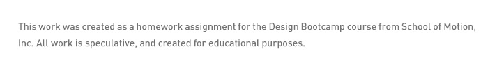
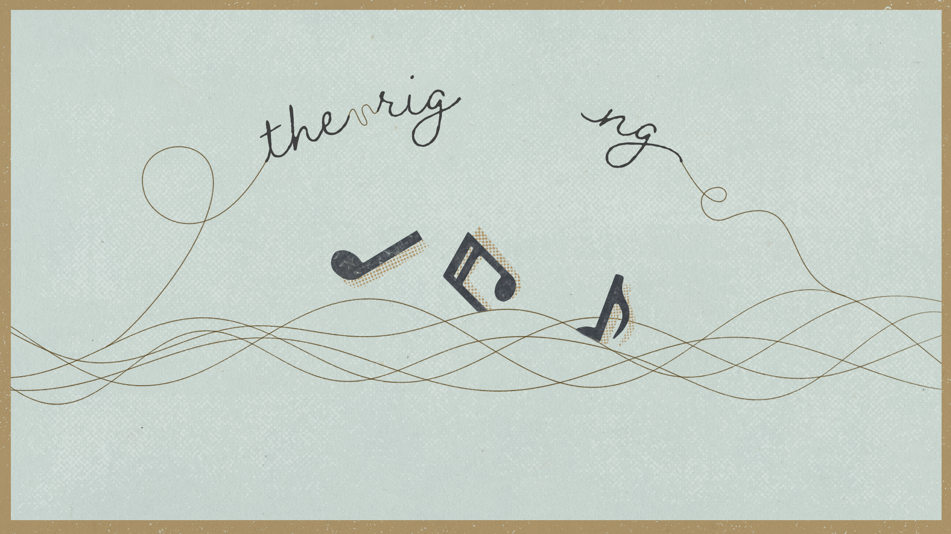
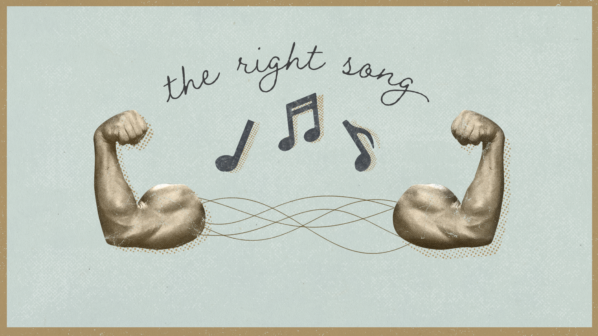
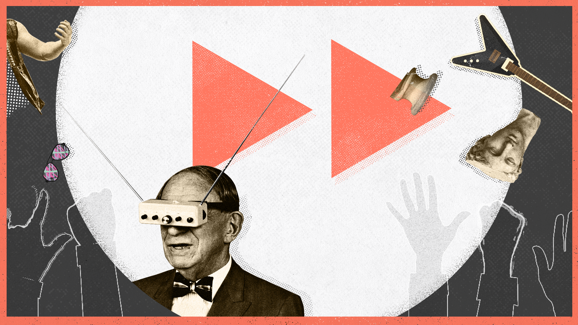
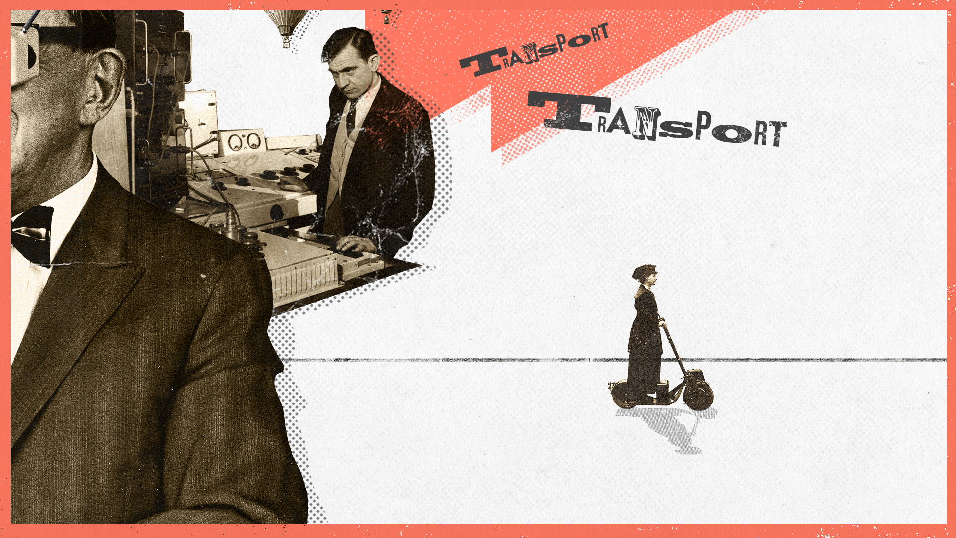
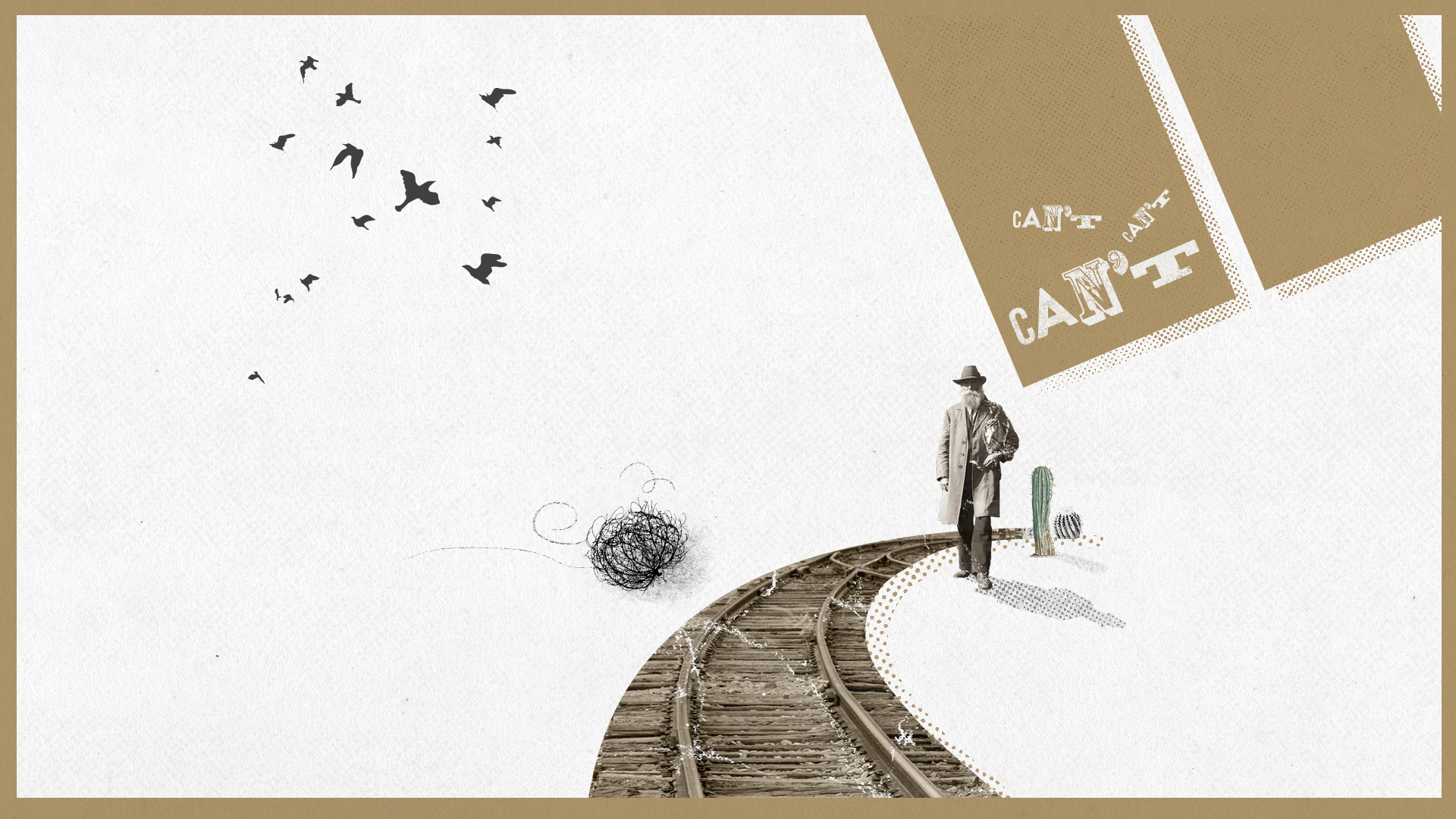
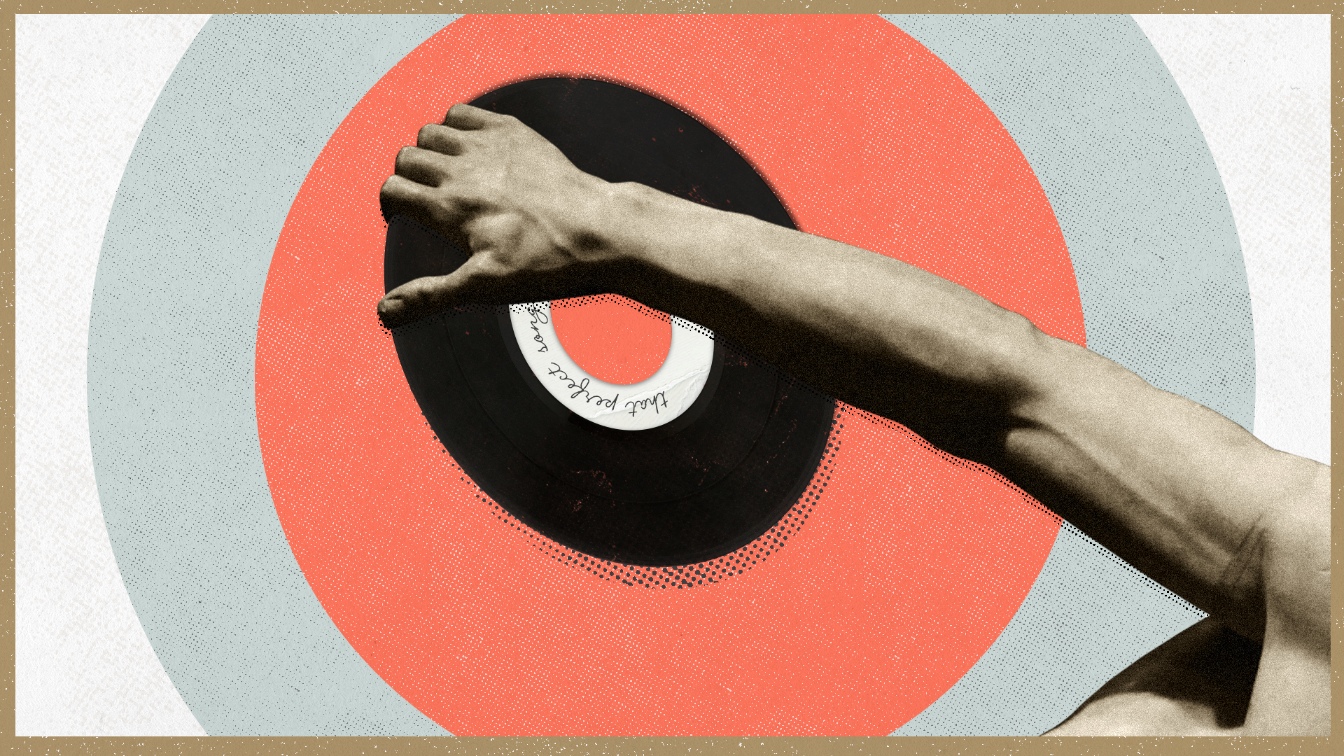
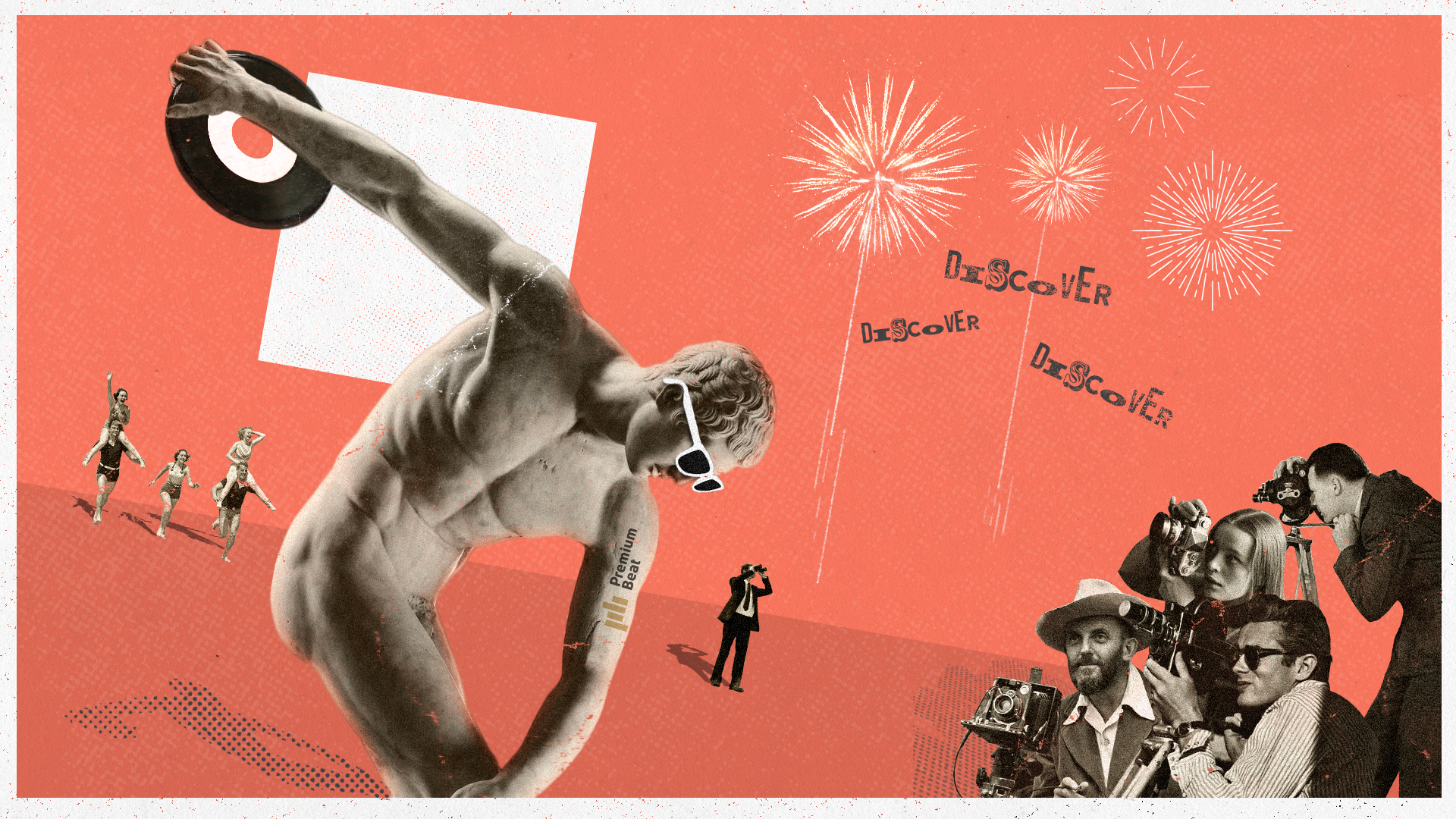
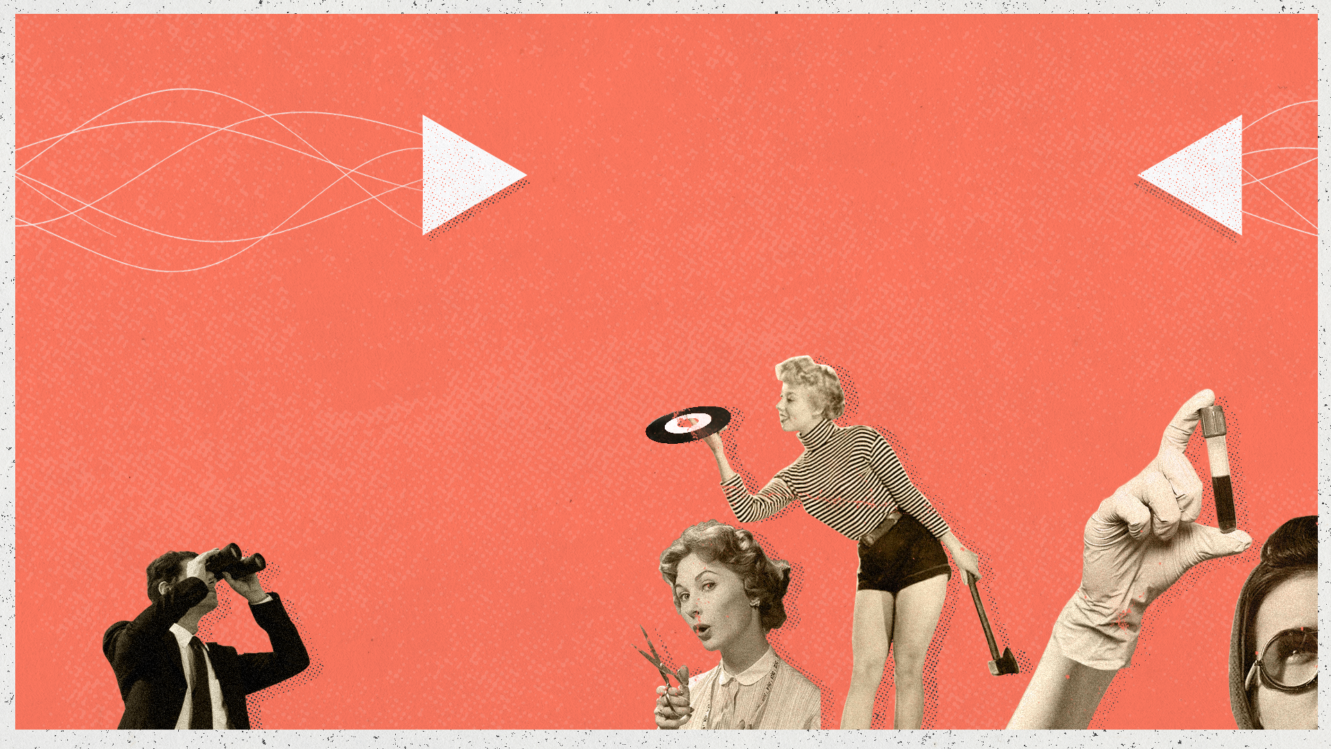
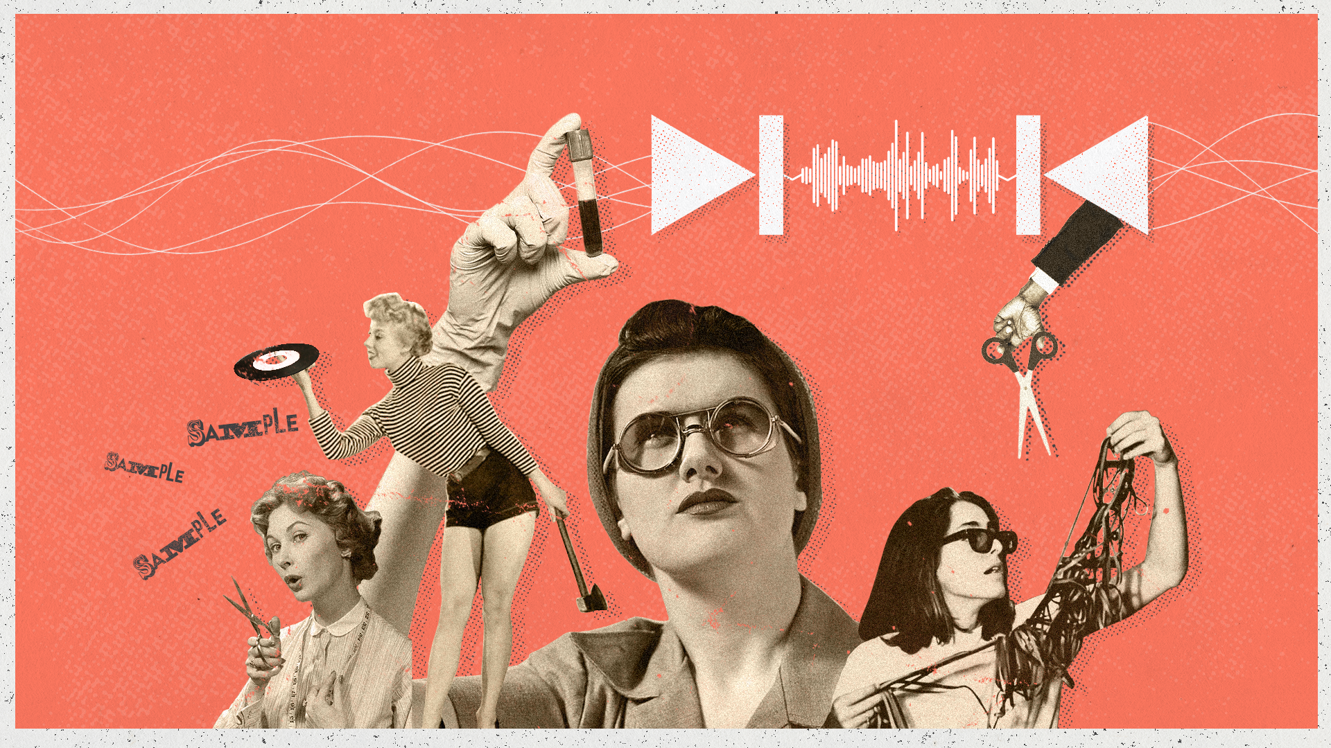
Design Board.


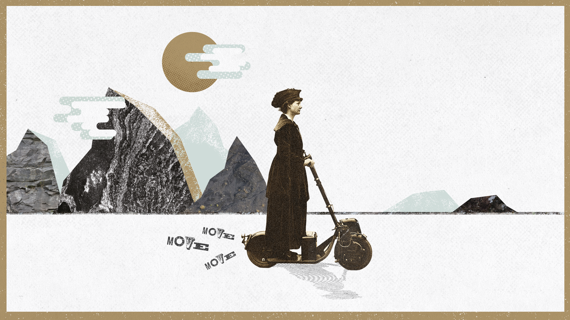
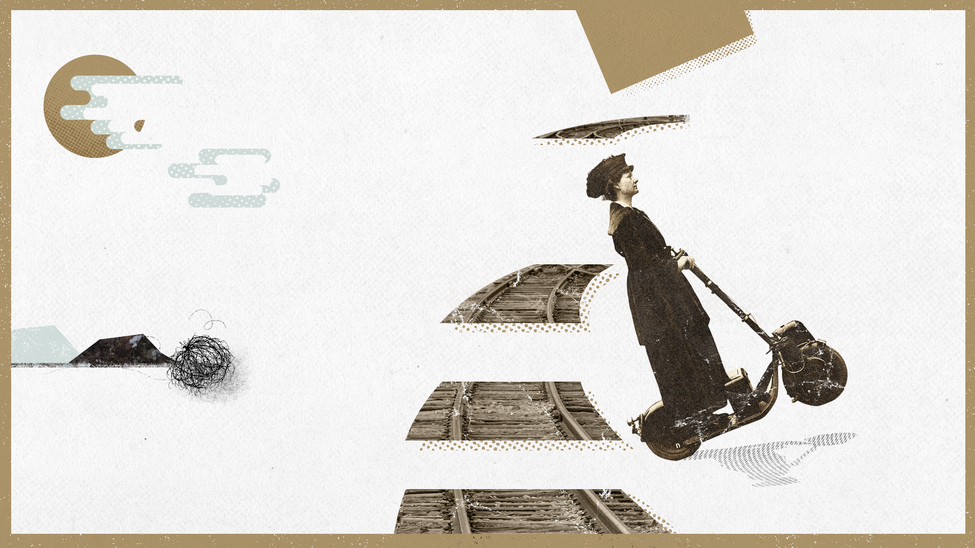


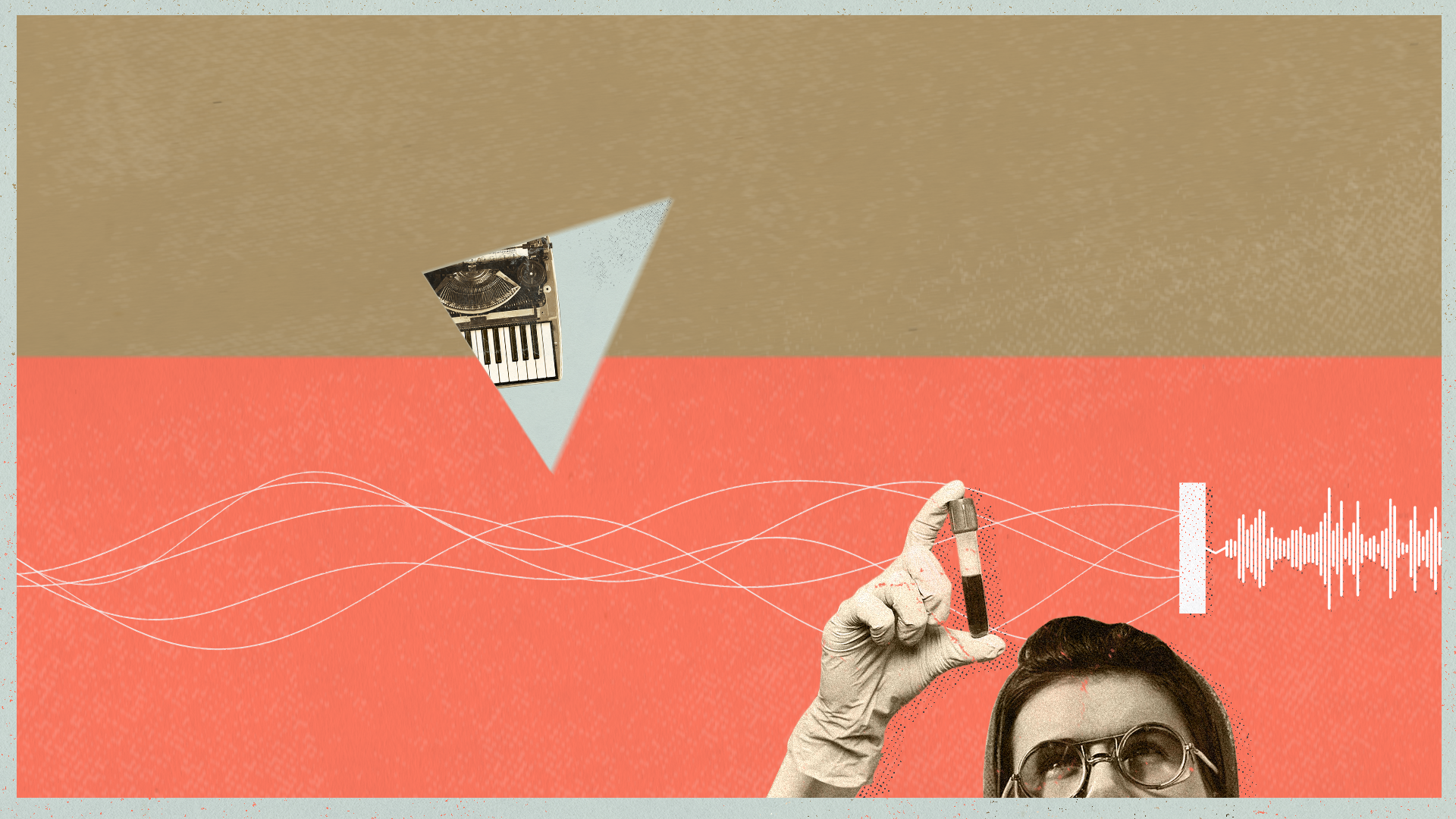
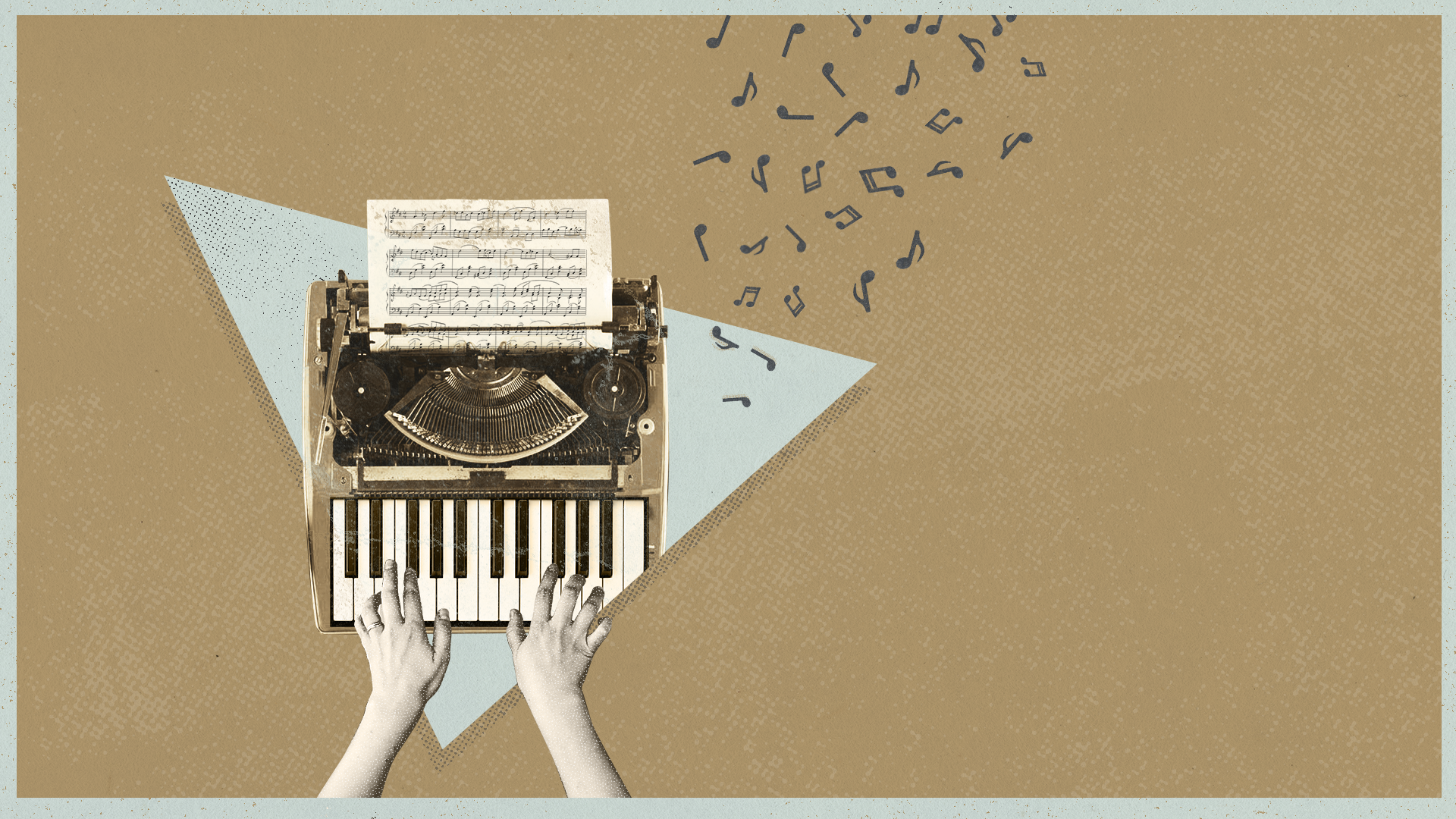


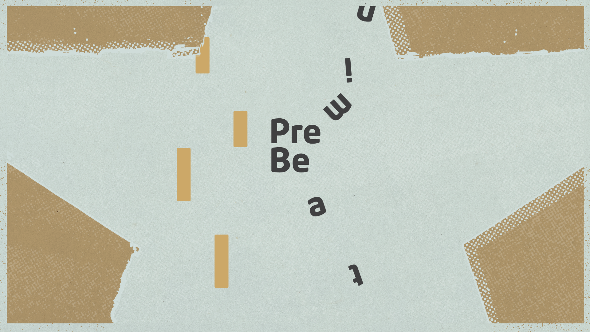
Animatic.
Concept Development.
1. Free writing.
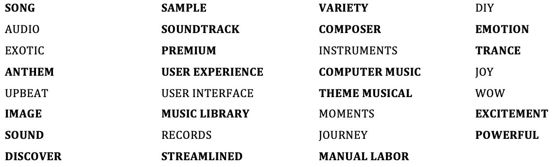
I tried free writing and some key words came up. I wrote about experiencing music, not paying attention to the script or the project itself so I didn’t miss a possible and not so obvious concept worth exploring.
2. Word List.
From the free writing I took some words.

I came up with a second list paying attention to the script and more focused on the project and brief related.
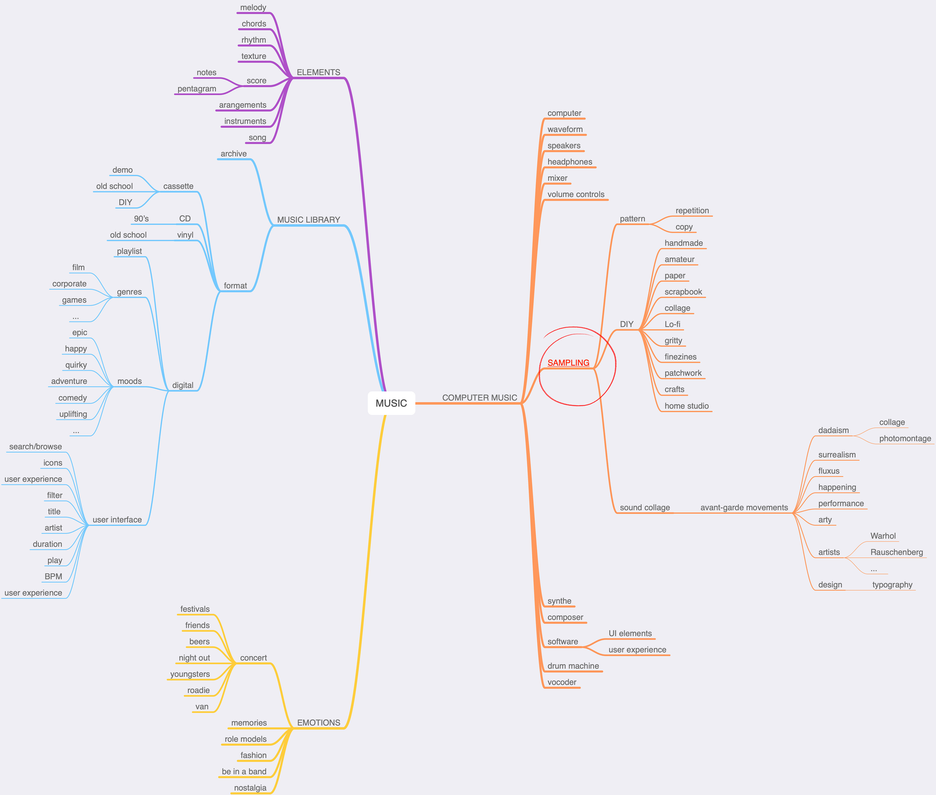
3. Mind Map
I filtered some words again for the mind mapping process trying to find a possible narrative and aesthetic associations, looking for some art directions for the piece.
I focused on the concept of sampling.
4. DOs & DON’Ts list.
I started to explore some creative directions and different concepts
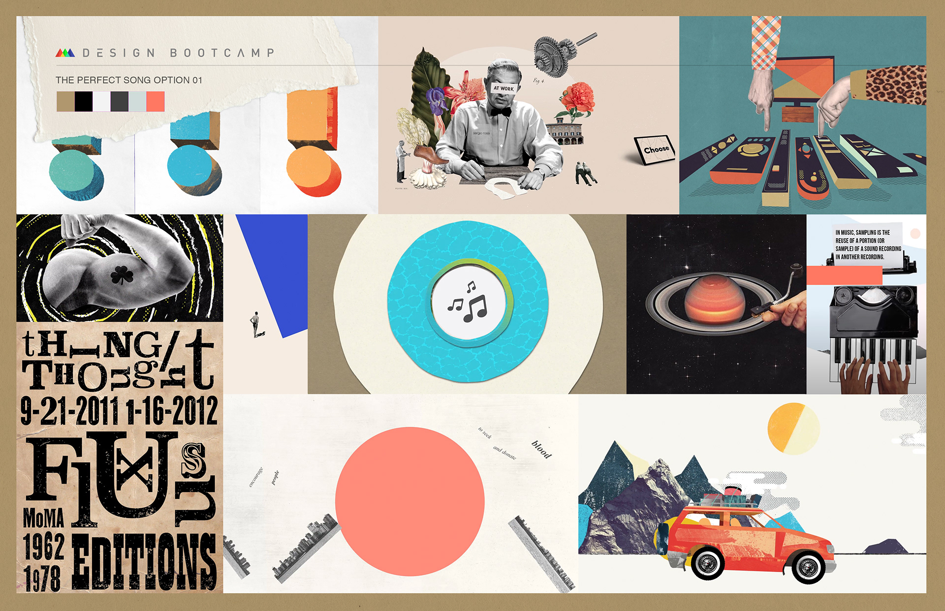
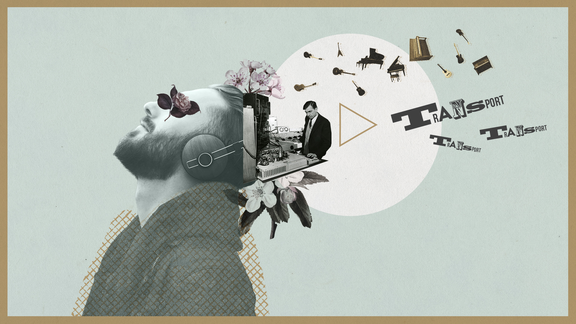
option #1
This first option is based on the concept of sampling, which by the way is related to the Premium Beat logo itself.
In music, sampling is the reuse of a portion (sample) of a sound in another recording.
The idea of sampling as I see it is very much related with the way some artists gather multiple elements from different sources and create a new original piece in its own right.
This way I would use the collage as a technique to introduce the different narrative and visual elements to tell the story: Photography, typography, color, textures and graphic elements.
From the narrative point of view I would like to avoid animations happening in the center of the frame transitioning from one to another.
I would like to create contrast having different scales and spatial planes within the frame.
I’d follow certain moving elements allowing me transitions from one frame to the other.
DOs
- Create variety using different visual elements.
- Playful typography
- Dynamic compositions
- Textured animated backgrounds
- Create contrast through scale
- Look for the unexpected through collage
- Create depth: use of spatial planes
DON’Ts
- Too busy compositions
- Plain backgrounds
- Fluid animation
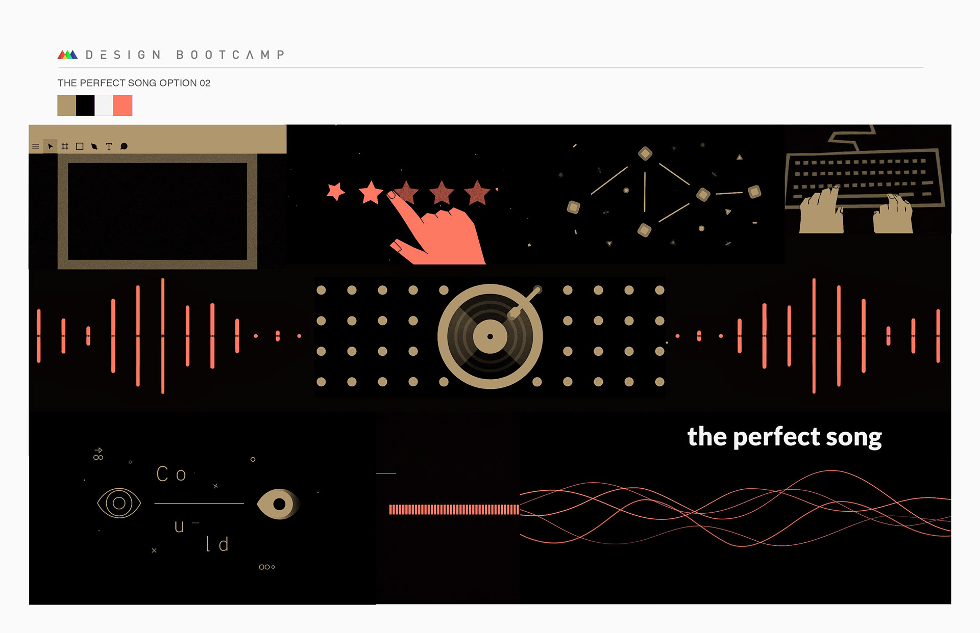
option #2
This option is inspired by the way the user interacts with the website when choosing the perfect song and the way the composer interacts with the software to create music.
Try to create visually the strongest impact with the minimal amount of lines, shapes and forms.
DOs
- Minimal design.
- Vector artwork.
- Smooth animation/transitions.
- Solid colors.
- User interface elements as graphic motifs.
- Line, shape, form.
DON’Ts
- Overcrowd the scene.
- Use too many colours.
- Use footage, pictures or 3D.
- Use textures.
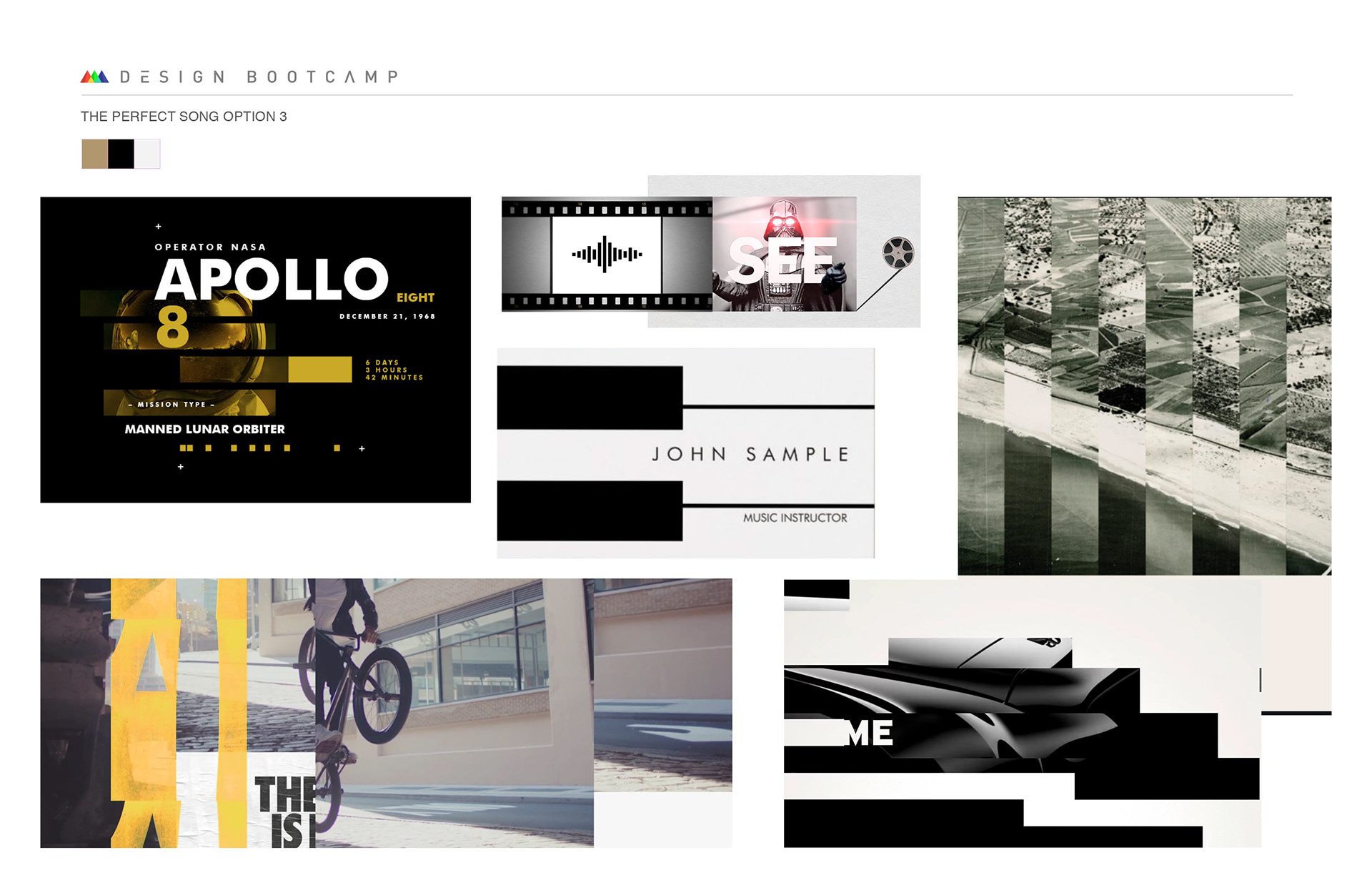
option #3
This option takes the inspiration directly from the Premium Beat logo and the use of rectangle shapes as a graphical element to tell the story.
Typography, graphic elements and footage will be mixed up within the frame, playing with the rectangle shape as a transition between images. The footage would be of people playing, listening or creating music.
DOs
- Black and white footage.
- Use of black and white and one accent color.- Rectangle as transition.
- Use some organic graphic elements to create contrast.
- Big Sans Serif Type.
DON’Ts
- Use circles or triangles.
- Use heavy textures.
- ...
5. Mood Boards.
I came up with some mood boards for each of the options.
Mood board option #1
Mood board option #2
Mood board option #3
6. Written treatments and storyboard.
Although I think Options 2 and specially 3 fits closer to the brand I decided to take some risk and go for the oddball.
Here I attach some captures of the process. Following the script I storyboarded some key frames and then I figured out the transitions between them. Although the final decisions were not there yet and things would change in the design stage, the final storytelling started to come up.

7. Style frames and final boards.
Just before starting to design the final board I wanted to design roughly one of the frames and check if it worked. As with the storyboards I wasn't there yet but it helped me to give one more step towards the final piece.
Style Frame option #1
...And that's all. Thank you!